

This post is part three in a series on mobile content marketing. We’re going to take a small diversion in this series now and enter into a subject often ignored in the world of mobile marketing: And that is why you need to test your mobile content site.
How your site works on mobile is an important part of your mobile content marketing. If you test your website in your mobile and discover it doesn’t display properly or takes a long time to load, how can you tell exactly what you have to fix?
Let your market give you your biggest clues, before “getting technical”. For example, check out this comment by a Saudi Arabian high school student:
“Yes today I use my cell phone only for calling – because my cell phone today doesn’t do anything else well enough to be useful. Nothing I have to hunt and peck for through 6 levels of navigation is worth using.”
Particularly note that last sentence, because it may tell you why your website is not mobile friendly.
Solving Small Screen Display Problems
Having your pages packed with too much content and too many tabs is an obvious place to start, when it comes to making your sites or blog posts more mobile friendly. For the “hidden” stuff that causes actual display problems, however, you’ll need to dig a little deeper.
Focus on width, rather than height, if you have to consider different mobile screen sizes. If the width is correct, minor scrolling will be less of a problem than text disappearing off the page. (Besides, the majority of all devices use one of only 3 basic widths: 128, 240 and 176 pixels.)
Here are 4 more tips you’ll want to utilize, when designing sites for mobile:
- Tell the browser what size your graphics are
- Consider pixel density as well as size. A graphic rendered at 240 PPI on one mobile device will display much smaller than one rendered at 72 PPI
- Graphics within your content should be no more than 80% of your screen width (That means keep all blog images below 200px wide, for the most part)
- Stretch graphic headers to 100% of the screen width
How to test your mobile content site
Two sites mobile web designers use regularly to locate hidden errors and locate a mobile content page that does not display the way it should:
Keep in mind that the results given won’t necessarily be for all types and makes of mobile devices, but it does give you an idea of where your site stands in the world of mobile readiness. Make sure you test your mobile content site as you seek to reach more markets.
Keep in mind also the difference between mobiles: For example, iPhones will not display Flash and are always set at a resolution of 320 X 480 (or 480 X 320) whereas Nokia screen widths can vary – especially with the older models – anywhere from 176 X 208 pixels up to 352 X 416 pixels.
If your market doesn’t use a particular make that is dragging down your results, it’s not as crucial to “fix” the problem. (For example, if your niche customers all use iPhones, you’ll want to dump Flash off your sites straight away!)
And if you’d like to clean up and optimize your CSS and XHMTL for mobile, just enter your website URL into their checkers.
You’ll get a “pass” or “failing” grade plus specific suggestions on how to more easily display your content via mobile. If you have any skill with coding or web design at all, you’ll most likely be able to go through your site point by point and clean up problems such as forgetting to fill out an “ALT” tag for your graphics or using the wrong attribute.
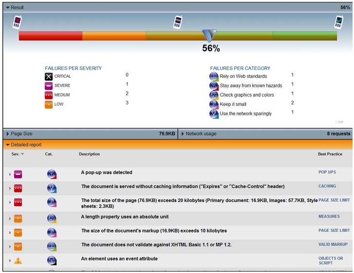
What happens when you test your mobile content site
Here’s a screenshot, below, of a typical result when you test your mobile content site:
(Many mobile testing sites also offer mobile web training courses.)
Of course, you can always simply outsource to a professional who specializes in mobile content design. But if the idea of making your content mobile ready is starting to send you off into a panic attack, do remember the other reason why there has been a huge explosion – in people switching from PC’s to mobiles to browse the web:
Newer phones tend to automatically render websites for the web (which wasn’t the case several years ago). Of course, if your subscriber doesn’t have a new phone, that might be a problem – but considering the rate at which mobiles go out of fashion and get replaced, it’s not one you want to lose sleep over.
A simpler, option you can use, in making sure your blog (at least) is mobile-ready…
Use a Mobile Friendly WordPress Blog Theme

There is certainly no shortage of these available – many of them free! Just go to WordPress.org and enter the words “mobile friendly” into the Search textarea box. Then sit back and pick and browse through the results…
What Not to Do, When Designing for Mobile Devices
- Never create automatically refreshing pages for mobile (they’ll incur extra download charges for the mobile user).
- Don’t use frames – most mobiles don’t read frames.
Smartphones will automatically detect sites automatically as mobile and display them as such.
Finally, don’t let designing web content for mobile devices overwhelm you. Test your mobile content site to boost your awareness rather than send you in a tailspin over making your sites display perfectly.
In the next post, we’ll take a closer look at one massive mobile marketing advantage you need to seriously consider – no matter what your marketing skill level. And that is creating mobile apps…
Our previous two posts on mobile content marketing: